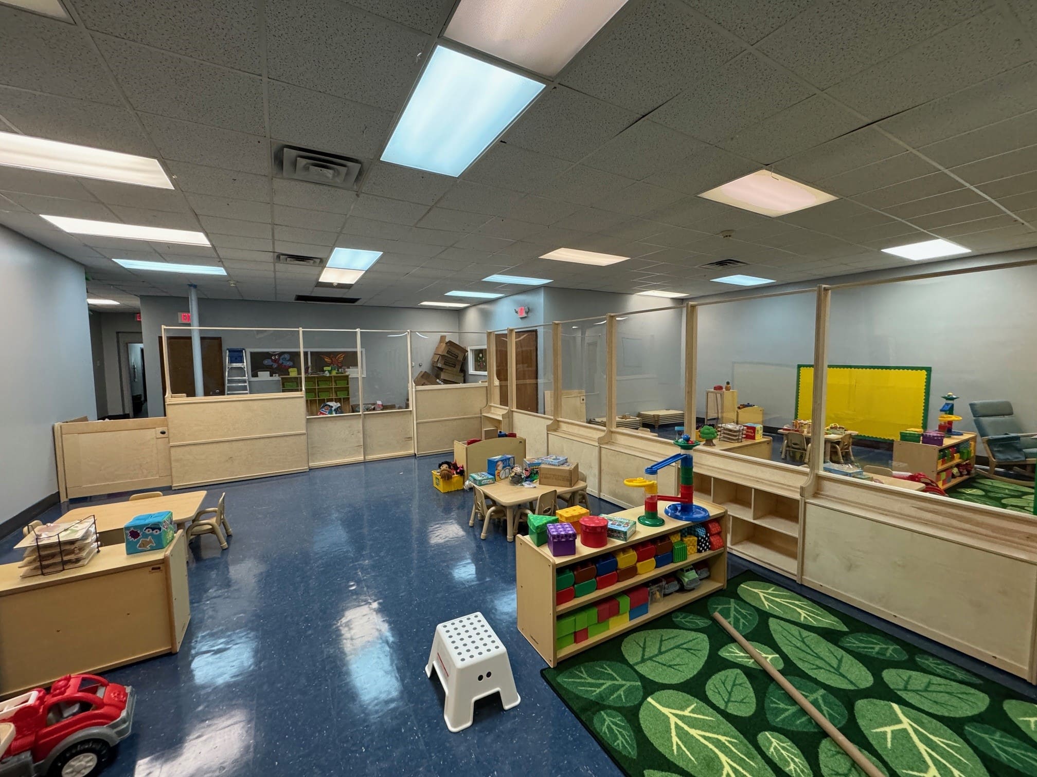
Classroom Decor Ideas for Early Learning Spaces
Key takeaways:
- Carnegie Mellon researchers found kindergarteners spent 38.6% of lesson time off task in a heavily decorated room versus 28.4% in a sparse one, and scored 42% on the test instead of 55%.
- NFPA's fire code caps artwork and teaching materials at 20% of wall area in a building without sprinklers, and 50% where the building is fully sprinklered.
- Pick the palette before the theme. Neutral walls with two or three accent colors survive a decor change; a fully themed room has to be gutted every August.
- Anything a child touches daily is furniture, not decor, and needs to be bought like furniture.
Walk into most preschool rooms in late August and you can see how much care went into the summer. Every wall is covered. There are three alphabets, two calendars, a word wall, a birthday chart, laminated rules, and a border on every board. Most classroom decor goes up like this, on unpaid evenings and somebody's own money, because they want the room to feel welcoming on the first morning.
That effort is real, and it deserves a better return than it usually gets. The children arrive a week later, and the room is loud in a way that has nothing to do with volume.
Good classroom decor is not about having less personality. It is about deciding what each wall is for before you put anything on it, and knowing which pieces are genuinely decor and which are furniture wearing a bright color. This guide covers both, plus the two constraints almost nobody mentions until an inspection: what your fire marshal allows on the wall, and what a two-year-old will do to a paper border by October.
What Classroom Decor Does to a Four-Year-Old's Attention
Decoration is not neutral background. In 2014, Carnegie Mellon researchers put 24 kindergarten children through six introductory science lessons in a laboratory classroom and changed only one thing: how much was on the walls.
In the heavily decorated room, children spent 38.6% of the time off task. In the sparse room, 28.4%. Their accuracy on the lesson questions went the other way: 42% correct in the decorated room, 55% in the sparse one. The study is published in Psychological Science, and you can read the Association for Psychological Science summary.
Two honest caveats. This was 24 children in a lab, not a real classroom tracked across a year, and the researchers said so themselves. It also does not mean bare walls are the goal, because a room with nothing on it gives a child nothing to return to.
What it does mean is that wall space has a cost, and the cost lands hardest on the youngest children in the building, whose ability to filter out what does not matter is still being built. That cost is worth spending deliberately, a principle that also governs thoughtful classroom design at the layout stage.
The 20% Rule Your Fire Marshal Already Knows
Here is the constraint that catches centers out, because no decor blog mentions it and no catalog puts it on the box.
Artwork and teaching materials can be attached to the walls of an educational occupancy, but not past 20% of the wall area in a building that is not fully sprinklered, or 50% in one that is. NFPA publishes the reasoning: the combustibility of artwork cannot be controlled, so the quantity is capped to stop a continuous combustible surface forming across the room.
Your local fire authority then applies its own reading. One county fire marshal's published fire code standard sets classroom display at 20% of total wall area, rising to 50% only where the room has a door exiting directly to the exterior and an approved smoke detection system, with corridors and assembly areas held to 20% of any wall.
Twenty percent is less wall than it sounds like, and the backing counts.
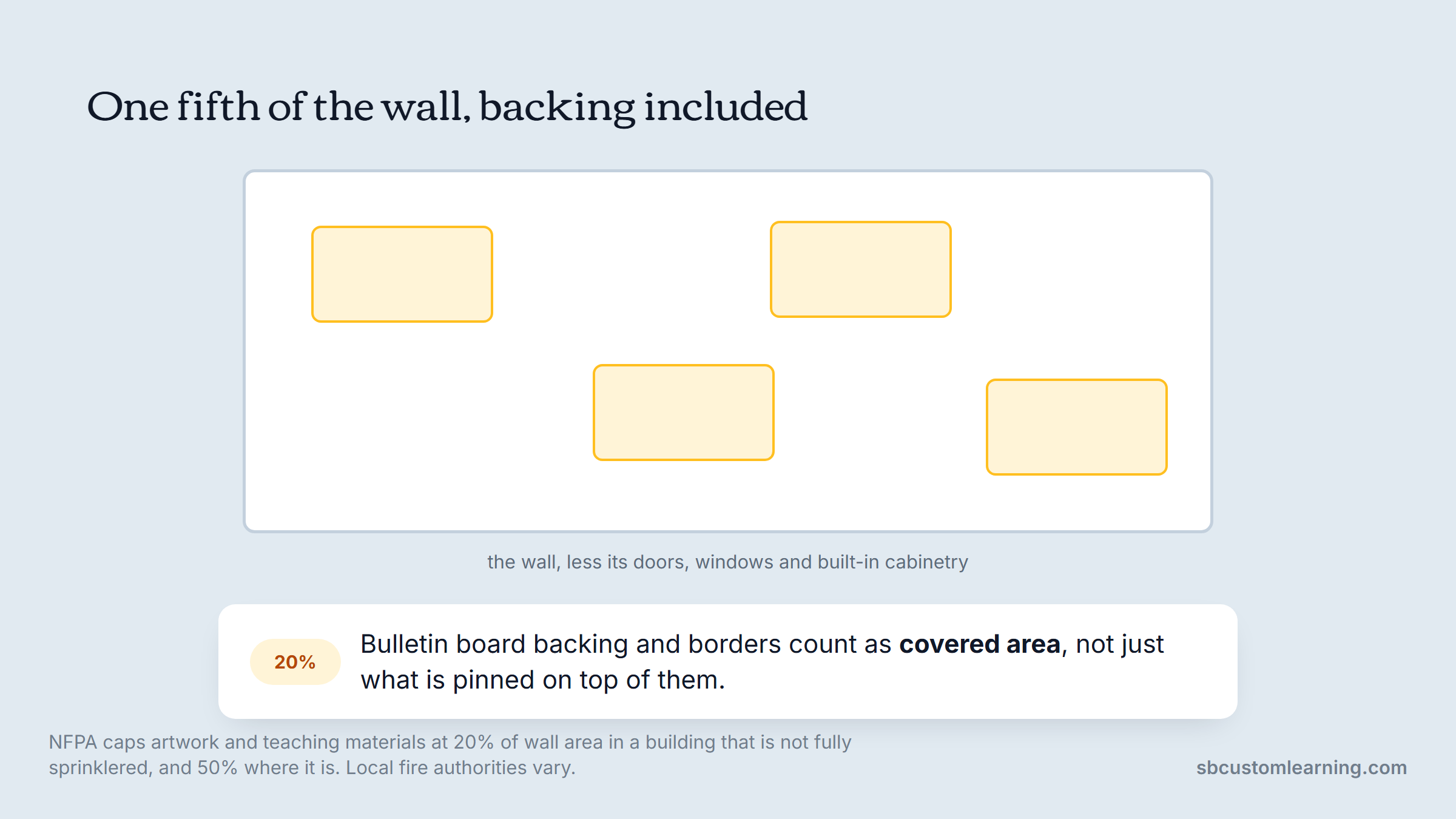
Paper burns fast and it burns hot. A wall that is 80% covered in construction paper, bulletin board backing, and laminated charts is a fuel load in a room full of people under four feet tall.
How to Measure Your 20% in Ten Minutes
You do not need a code consultant for this. You need a tape measure and a calculator.
- Measure the length and height of each wall, then multiply to get the square footage of that wall.
- Subtract doors, windows, and any built-in cabinetry, since those are not display surface.
- Multiply the remaining number by 0.20. That is your paper budget for that wall in square feet.
- Measure your existing displays, counting bulletin board backing and borders as covered area, not just the items pinned on top.
- Take down whatever puts you over, starting with anything laminated that has not been referenced since September.
Call your local fire marshal afterward and ask what they enforce, because interpretation genuinely varies between jurisdictions and the person who inspects you is the one whose answer counts.
Start With the Walls You Are Not Going to Decorate
The fastest improvement in most rooms is subtraction, and it costs nothing.
Pick one wall per room and leave it quiet. The usual choice is the wall children face during group time, because that is when you most need their attention on a person rather than on a border. A calm wall behind the teacher is not wasted space; it is the thing that makes everything else on the other three walls readable.
If the room has no wall you can afford to give up, the honest answer is that the room needs another one. A proprietary wall adds usable surface and a quiet side without permanent construction, which is usually cheaper than reorganizing around a wall that was never there.
Look next at what sits at adult eye level. Most of it is for adults. Charts, policies, staff reminders and parent notices belong in the entryway or the hallway, not at four feet above a rug where a three-year-old is trying to listen. Anything a child cannot read and will never use is decoration for a visitor.
The rule that keeps this honest: everything below 40 inches belongs to the children, everything above it should be earning its place. That height is not arbitrary, since it is roughly where a standing preschooler's eye line lands and about the ceiling of what most four-year-olds reach without stretching.
Choose a Palette Before You Choose a Theme
Neutral classroom decor got popular for a reason, and then it got oversold. The point was never beige. The point is that a low-contrast background makes the high-contrast things readable.
Work in three tiers. Walls, large furniture, and floor covering stay quiet: warm white, soft gray, natural wood, a muted sage or clay. Two accent colors carry through textiles and storage. Then bright color is reserved for the things you want a child to find, like the label on a bin or the marker for a learning area.
Pastel classroom decor works the same way and fails the same way. Pastels used everywhere are just a quieter version of too much, and they wash out the cues you actually need children to see.
The practical test: stand at the door and name the first three things your eye lands on. If they are not the things you would want a child to notice first, the palette is doing the wrong job. We work through this same question at the layout stage in our Montessori-inspired classroom guide, where accessibility and calm are the whole design brief.
Make Every Display Do a Job
A display earns its wall by being used. Most are not.
Sort what is currently up into three piles. There is reference material children genuinely use, like a helper chart or a visual schedule they check. There is children's own work, which is the highest-value thing on any wall. And there is everything else.
Children's work should be the largest category and it almost never is. Mount it at child height, unframed and unlaminated, with the child's own words captioned underneath where they can dictate them. A wall of twenty near-identical adult-cut paper apples is not children's work; a wall of twenty genuinely different attempts is.
Only one of the three piles should be growing.
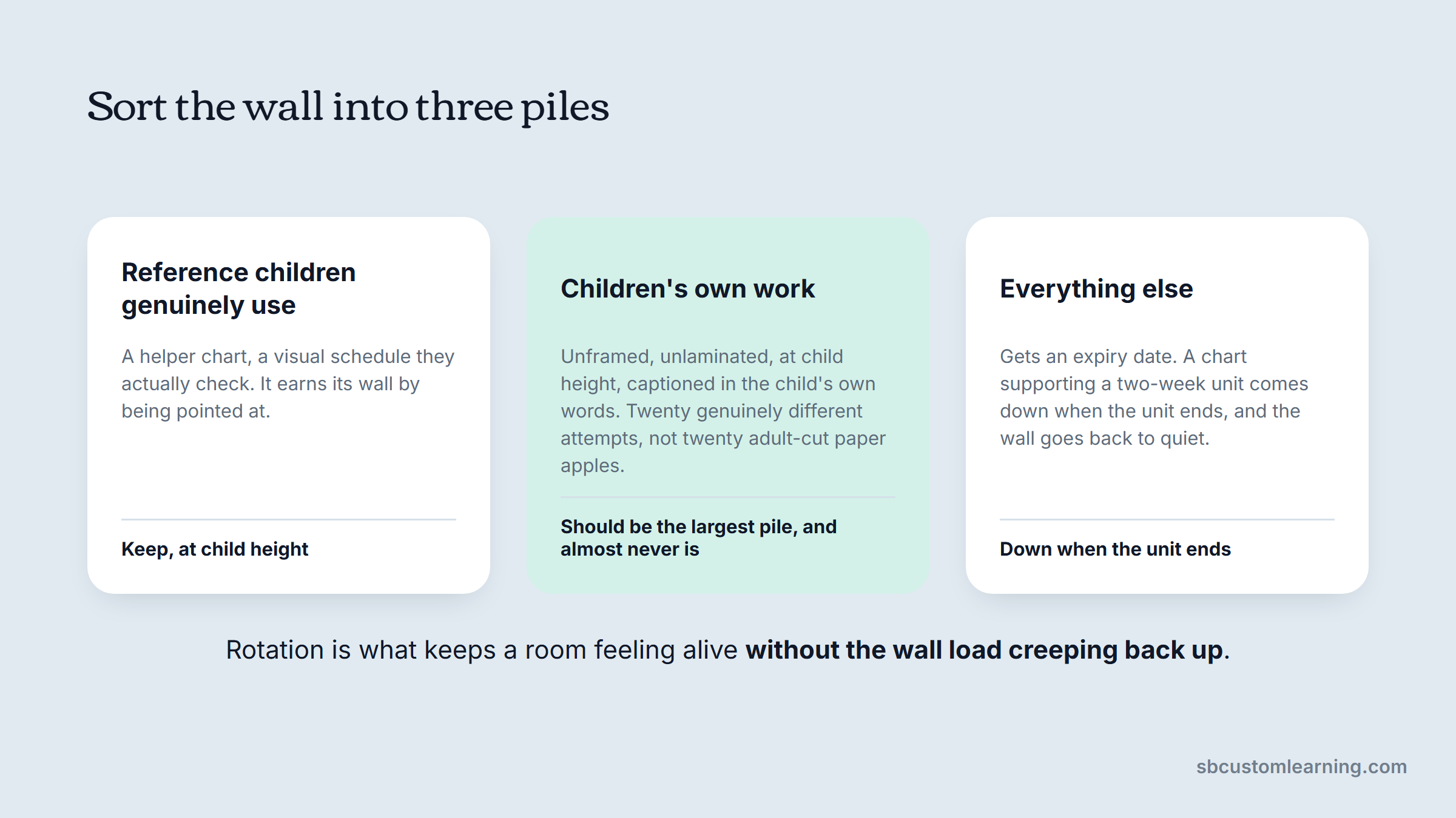
Give the rest an expiry date. A chart supporting a two-week unit comes down when the unit ends, and the wall goes back to quiet until the next one needs it. Rotation is what keeps a room feeling alive without the wall load ever creeping back up.
Themes That Survive Past October
Themes are not the problem. Permanent themes are.
An under the sea classroom decor scheme done as textiles, a reading-corner rug, a few wall pieces and a book selection can be swapped in a weekend. The same theme done as painted murals, custom cabinet fronts and a ceiling installation is a five-year commitment made by whoever happened to be in the room in 2021.
Split every theme decision into three layers by how long it lives:
| Layer | Examples | Lifespan | Who should own the choice |
|---|---|---|---|
| Permanent | Wall color, flooring, built-in cabinetry, casework | 7 to 15 years | The center, with design input |
| Semi-permanent | Carpets, storage units, partitions, lofts | 5 to 10 years | The center, chosen for durability |
| Seasonal | Wall displays, fabric, small props, book faces | 4 weeks to 1 year | The teacher in the room |
Keep theme at the seasonal layer and a teacher can change their mind in August without a purchase order. Push it down into the permanent layer and you have bought a decision that outlasts the staff who made it. The furniture trends we watched at NeoCon this year all leaned the same way: neutral, durable pieces underneath, with color and personality living in the layers you can change.
DIY Classroom Decor and What It Costs You in March
DIY classroom decor is not a moral failing and it is not free. It is a trade, and the trade is worth making on some things and not others.
An early childhood teacher on Reddit cleared out a supply closet and found roughly 60% of it was cheap craft and decor stock bought a dollar at a time, most of it never used.
The replies pushed back hard, and fairly. Teachers buy cheap because the field is underfunded and they are spending their own money, and one commenter put it bluntly: there is no point buying quality when toddlers will destroy it within minutes anyway.
Both things are true at once, which is what makes this a genuinely hard call rather than a lecture. It is also one thread rather than evidence, so treat it as the sound of the argument, not the settlement of it.
The line that holds up in practice is contact frequency. If children touch it every day, buy it once and buy it properly. If it hangs on a wall above their reach and changes with the season, cheap and disposable is the correct answer.
One question sorts almost every decor purchase a center makes.
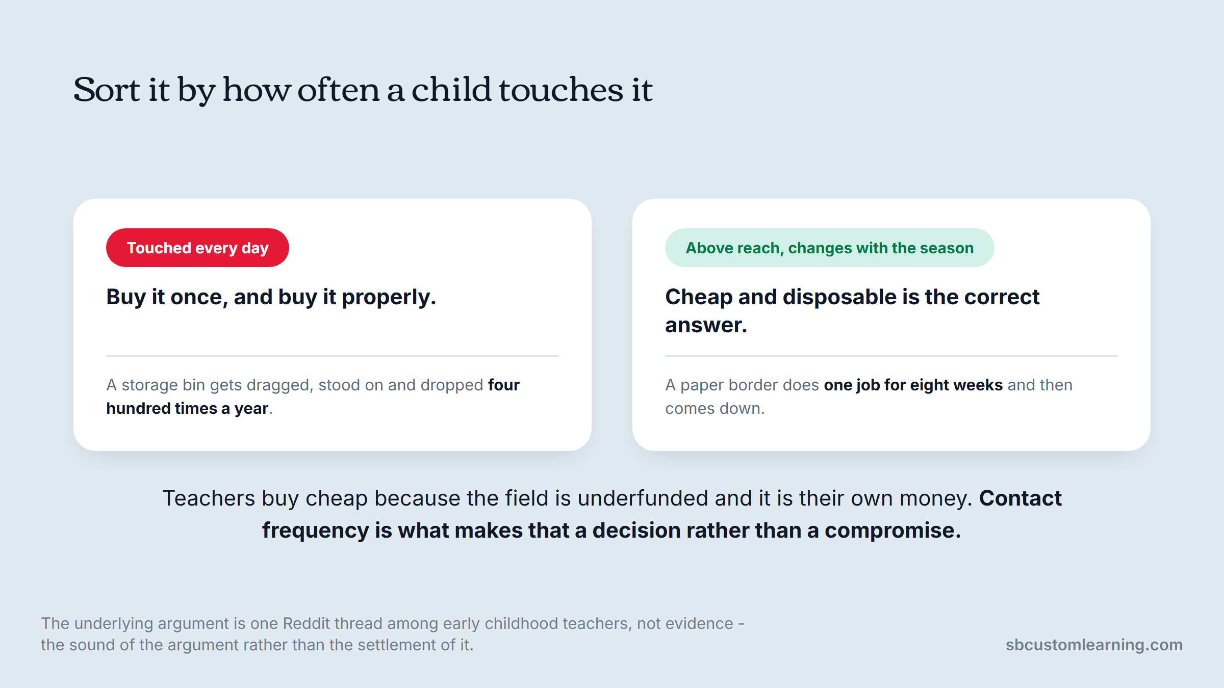
That is why a $4 paper border is fine and a $4 storage bin is not. The border does one job for eight weeks; the bin gets dragged, stood on, and dropped four hundred times a year.
The Decor That Is Actually Furniture
Half of what centers call decor is structural, and buying it from the seasonal budget is why those pieces wear out long before they should.
Carpets define areas and absorb noise, which makes them acoustic equipment with a pattern on top. Cubbies are the first thing a family sees each morning and the thing a child uses six times a day. Room dividers set the whole traffic pattern. Lofts and play structures are the visual anchor of a room and also a piece of equipment children climb on.
None of that is decoration, and none of it should be chosen from a photograph.
We build a lot of these pieces to fit the room rather than the catalog, because early learning rooms are full of odd corners, load-bearing columns and windows in the wrong place.
One director we worked with, Sonja Stamenkovic, described the result as everything delivered on time and beyond what they expected. That is mostly a comment about pieces being made for the room instead of squeezed into it. The finished rooms in our work gallery show what it looks like across cubbies, walls, lofts and themed spaces.
Buy Once, Rotate Often
The split is easier to hold onto as a purchasing rule than as a design principle.
| Category | Buy once, for durability | Rotate seasonally, buy cheap |
|---|---|---|
| Floor | Commercial-grade carpets and rugs | Small area mats and cushions |
| Storage | Cubbies, shelving, cabinets, bins | Bin labels and photo tags |
| Walls | Mounted display rails and tack surface | Paper, borders, seasonal prints |
| Zones | Partitions, lofts, dividers | Fabric drapes, banners, props |
| Furniture | Tables, chairs, sensory tables | Table-top themed props |
Sort a purchase list into those two columns before ordering anything, and the annual decor spend usually drops while the room looks better, because the money moves to the things that were quietly failing.
A Room-by-Room Decor Plan
Different rooms need different decisions, and treating a center as one design brief is how the infant room ends up with a word wall.
In the infant room, most of the decor should be low and horizontal, because the children are on the floor. Mirrors at floor level, soft contrast on the lower half of the wall, and almost nothing above three feet. Avoid mobiles and hangings over sleeping areas entirely.
In the toddler room, everything below three feet needs to survive being pulled, so display goes behind acrylic or above the pull line. This is where families of photographs work best, because a two-year-old recognizing their own family on the wall settles a hard drop-off faster than anything you can say.
In the preschool room, children's own work takes over, learning areas get clear visual boundaries, and the visual schedule earns permanent space at child height. Science classroom decor belongs here rather than in a themed corner: real specimens, magnifiers, a rotating display shelf and photographs of children investigating, not clip-art atoms.
The same wall answers to a different question in each of the three rooms.
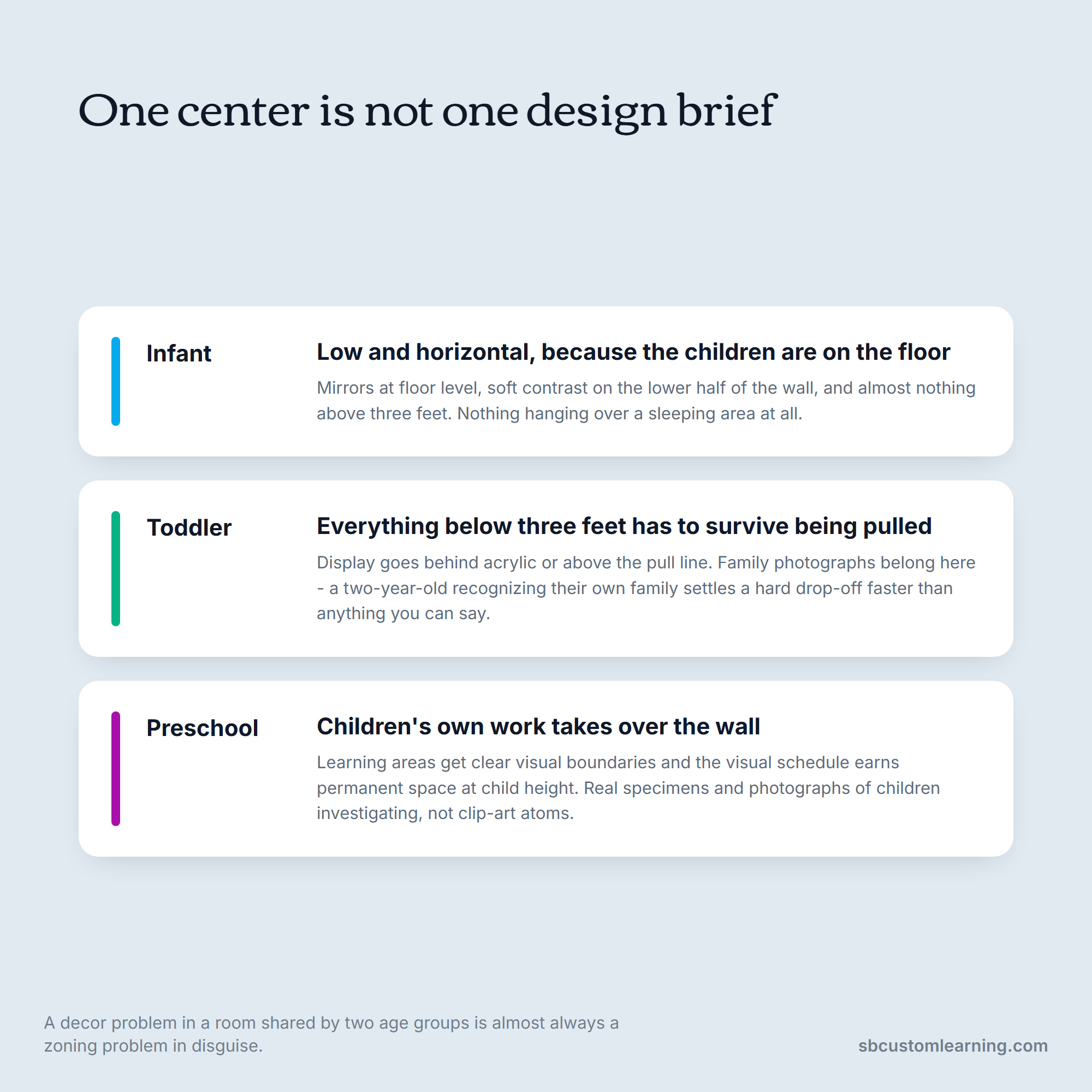
Rooms that share a space need one more decision, which is where one area visually ends and the next begins. Our design consultation and space planning usually starts there, because a decor problem in a shared room is almost always a zoning problem in disguise.
Where to Start When the Walls Are Already Full
Nobody strips a classroom in one evening, and nobody should have to.
Work in three passes over three weeks. First pass, take down anything laminated that has not been pointed at since the start of the year, and everything above adult eye level that is meant for adults. Second pass, clear one full wall to quiet and live with it for a week before deciding whether it needs anything. Third pass, replace the largest remaining adult-made display with children's work at their height.
Photograph the room before you start and again after each pass. Three weeks in, the photographs make the argument for you with the staff who were nervous about it, which is usually the actual obstacle rather than the walls themselves.
Where the Budget Should Go
Most early learning decor budgets are spent backward: heavily on paper and props, thinly on the things children physically use.
A useful reallocation is to spend on the floor first, then storage, then walls last. Carpets and cubbies are seen and touched every day by every child and last a decade. Wall paper is seen constantly and touched never, and it is replaced annually.
Reversing the order is most of the saving.
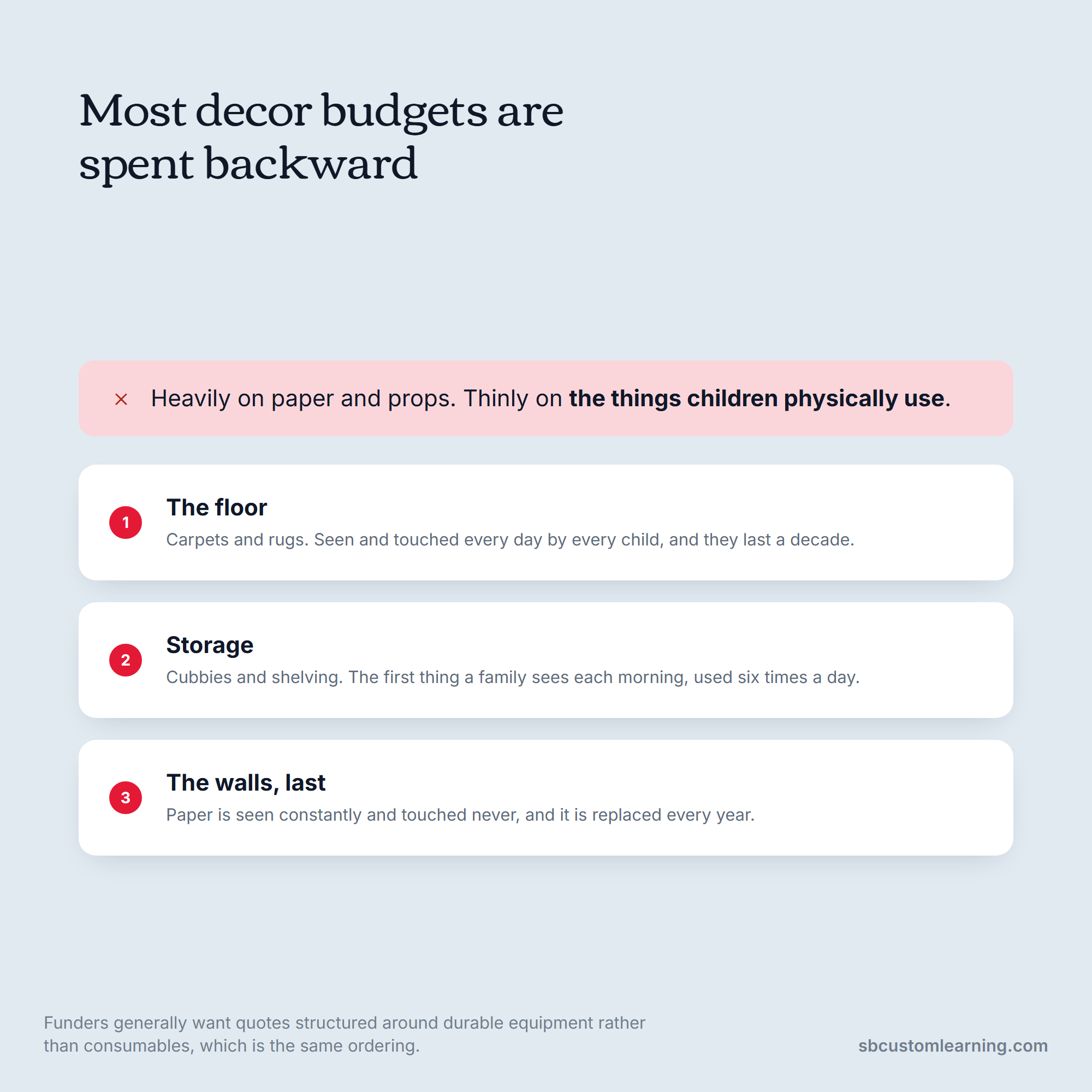
If your center is working from a grant or a fixed budget, the sequence matters even more, because funders usually want quotes structured around durable equipment rather than consumables. We format quotes and estimates that way for exactly that reason, and the supply list we publish separates the two categories for the same purpose.
Getting the Next Refresh Right
The rooms that look good in year three are not the ones that were decorated hardest in year one. They are the ones where somebody decided early which layer each choice belonged to, kept the wall load under what the fire marshal allows, and put the money into the surfaces children actually touch.
Start with subtraction, set your palette before your theme, and treat carpets, cubbies and dividers as equipment rather than decoration.
If you want a second set of eyes on a room before you order anything, talk to our team. We will look at your layout, your age groups and your budget, and tell you which of your decor problems is really a furniture problem. Our shopping is fully online rather than through a showroom, so we send samples out when you need to see a finish in the room's own light before committing to it.
FAQs
How much of a classroom wall should be covered?
NFPA's fire code caps artwork and teaching materials at 20% of wall area in a building without automatic sprinklers, and at 50% where the building is fully sprinklered. Some jurisdictions tie the higher figure to different conditions, such as a direct exterior exit and approved smoke detection.
Measure your wall area, subtract doors and windows, and multiply by 0.20 to get your paper budget. Then confirm with your local fire marshal, since enforcement genuinely differs by jurisdiction and theirs is the interpretation that counts.
Does neutral classroom decor mean the room has to look boring?
No, it means the bright color goes somewhere specific instead of everywhere. Keep walls, large furniture and flooring quiet, run two accent colors through textiles and storage, and reserve high-contrast color for the things children need to find, like bin labels and area markers.
A room built that way usually reads as calmer and more colorful at the same time, because the color that is left has something to stand against.
What classroom decor ideas work best for toddlers specifically?
Anything below three feet has to survive being pulled, so put display behind acrylic or above the pull line, and skip paper borders at toddler height entirely.
Family photographs at child height do more work than any other decor in a toddler room, because recognizing their own people shortens a hard morning drop-off. Keep the area above three feet mostly clear so the room stays legible to a child who is still learning to filter.
Is DIY classroom decor worth the time it takes?
It depends entirely on how often children touch the item. Wall pieces that hang above reach and change every season are a reasonable place to save money, and a homemade display costs little if it fails.
Anything handled daily is the wrong place to economize. Bins, seating, carpets and storage get used hundreds of times a year, and a cheap version fails in the middle of the year when there is no budget left to replace it.
How often should we change classroom decor?
Change the seasonal layer, meaning wall displays, fabric and props, every four to eight weeks or whenever a unit ends. Leave the semi-permanent layer of carpets, storage and partitions alone for five to ten years, and treat wall color and casework as a decision you make roughly once a decade.
Children's work is the exception and should turn over continuously, since a wall of last month's projects stops being read within days.