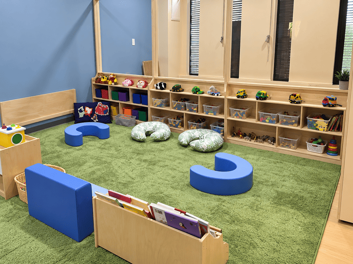
How to Create Interactive Learning Spaces in Early Childhood
Key takeaways:
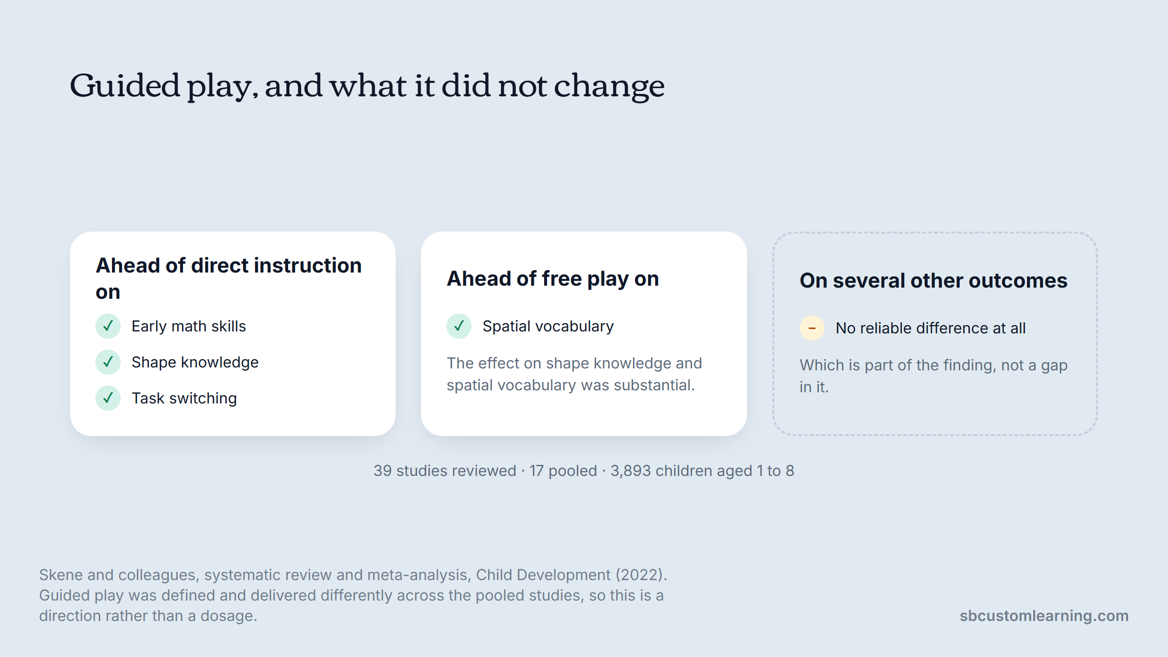
- In a meta-analysis of 3,893 children aged 1 to 8, guided play beat direct instruction on early math, shape knowledge and task switching, and beat free play on spatial vocabulary.
- Interactive learning in a preschool room is a furniture and layout problem before it is a curriculum problem. A center a child cannot reach is a center a child does not use.
- Two small sensory areas usually work better than one large one, because children use them for calming as often as for play.
- Screens are the smallest part of this. The eight centers a state education agency actually recommends contain no technology at all.
Search "interactive learning" and you will get interactive whiteboards, flat panels and software subscriptions, most of it written for high school or college.
Almost none of it is written for a room of three-year-olds. That is a strange gap, because early childhood is the one setting where interactive learning is not a teaching technique at all. It is the default. Children that age learn by handling things, and the question for a director is not whether to make learning interactive but whether the room lets it happen.
This guide is about the physical side: which centers earn their floor space, what height they have to sit at, how many children each should hold, and how to keep a space interactive after the novelty wears off in week three. We design and furnish these rooms for a living, so the specifications here come from what actually gets installed and what comes back to us as a complaint.
What Interactive Learning Means in a Room of Four-Year-Olds
Strip away the edtech vocabulary and interactive learning means the child acts on the material and the material responds.
Pouring water from one container into another is interactive. Watching a teacher pour water is not. A magnetic tile that snaps to another gives instant feedback, which is why a child will keep going long after an adult expected them to stop. A worksheet gives feedback tomorrow, if at all.
That definition has a useful edge to it. It rules out a lot of what gets sold as interactive, and it rules in a lot of very ordinary furniture. A sand and water table is an interactive learning environment. A well-stocked block corner is one too. A television playing a video is not, however good the video is.
The practical consequence is that most of your budget here should go to surfaces, storage at child height, and materials, not to devices.
What the Evidence Says About Guided Play
The research does not say children should be left alone with interesting objects, and it does not say adults should run the lesson. It points at the middle.
A systematic review and meta-analysis by Skene and colleagues, published in Child Development in 2022, reviewed 39 studies and pooled 17 of them covering 3,893 children aged 1 to 8. It compared guided play, where an adult sets up the materials and steers gently toward a goal, against both direct instruction and completely free play.
Guided play came out ahead of direct instruction on early math skills, shape knowledge and task switching, and ahead of free play on spatial vocabulary. The effect on shape knowledge and spatial vocabulary was substantial. On several other outcomes the authors found no reliable difference at all.
The wins are specific, and so is the list of things that did not move.
Two things follow for anyone furnishing a room. Adults need to be able to get into the play, so centers need floor space for a kneeling adult, not just for children. And the materials have to carry the learning goal themselves, because the adult is guiding rather than instructing.
The authors were careful to note that guided play was defined and delivered differently across the studies they pooled, so treat the numbers as a direction rather than a dosage.
The Eight Centers That Carry Interactive Learning
Rather than invent a list, it is worth using one a state education agency has already published and defended.
The Texas Education Agency's guidance on learning centers in prekindergarten names eight, each tied to specific prekindergarten guidelines. Not one of them is a screen. The table below pairs each with what it needs physically, which is the part the guidance leaves to you.
| Center | What the child does | Furniture it actually needs | We plan for |
|---|---|---|---|
| Dramatic play | Role-play with life-like props | Child-height kitchen units, mirror, dress-up storage | 3 to 4 |
| Construction | Builds with blocks, tiles, vehicles | Low open shelving, a non-carpet or short-pile floor | 3 to 4 |
| Library and literacy | Reads, retells with puppets | Front-facing book display, soft seating, low light | 2 to 3 |
| Writing | Draws, laces, uses tweezers | Small table at elbow height, tool caddies | 2 to 3 |
| Art and creativity | Open-ended making | Easel, drying rack, washable surface near a sink | 3 to 4 |
| Science and discovery | Inquiry with natural materials | Light table, magnifiers, a windowsill if you have one | 2 to 3 |
| Math | Counting, sorting, measuring | Tabletop area, clear bins of manipulatives | 2 to 3 |
| Sensory | Sand, water, dough, beans | Sand and water table, a wipeable floor, storage for smocks | 2 to 3 |
The right-hand column is our own planning figure rather than anything the agency publishes, and it scales with your room and group size. Treat it as a starting point to argue with, not a standard.
The agency also makes a point worth stealing: centers can be split into smaller tabletop areas when space is tight, and literacy and math materials should be scattered through the other centers rather than quarantined in their own. Books belong in the block corner too. Our own project gallery is organized by these same areas, which is a fair check that the list reflects how rooms get built rather than how guidance documents get written.
Reach and Height Decide Whether a Center Gets Used
A center fails for physical reasons far more often than pedagogical ones, and the failure looks like disinterest.
If the material sits above a child's shoulder, they will not take it down without help. If the shelf is too deep, whatever is at the back is invisible and effectively gone. If the table is above elbow height, fine motor work gets harder and the child leaves sooner. None of this reads as a furniture problem when you watch it. It reads as a child who is not interested in the writing center.
Before you conclude a center is not working, walk through these checks at the child's eye level rather than your own.
- Crouch to the height of the shortest child in the group and look at the shelf straight on.
- Confirm the most-used materials sit between knee and shoulder height for that child.
- Check that no shelf is deeper than a child's forearm, so nothing hides at the back.
- Sit in the chair and see whether the table top lands near your elbow when your feet are flat.
- Count how many children can physically stand at the center without touching each other.
That last check is the one directors skip. A dramatic play center sized for two will generate conflict all year in a room where four children want to be in it, and that conflict gets recorded as a behavior issue rather than a square-footage issue.
Open shelving set at the child's own height is the single change that makes the most centers usable at once, and it is the core of a Montessori-inspired classroom on any budget. Our design consultations start with age group and group size for the same reason, since the fix is usually a different footprint rather than a different rule.
Two Small Sensory Areas Beat One Big One
The most useful piece of layout advice we have seen recently came from a teacher rather than a designer.
In a thread on Reddit about essential areas in preschool rooms, one teacher argued that two or more small sensory areas work better than a single large one, because children often use sensory play for calming or for time on their own rather than for group activity. Another described deliberately setting up stations sized for one or two children to support those who need to explore alone before joining a group.
This is one teacher's experience rather than a study, so weigh it as such. It matches what we see in finished rooms closely enough to design around.
The implication runs against how most catalogs sell sensory equipment, which is as one large table for the room. Split the function instead: a wet sensory station near the sink, and a dry one, a light table or a dough area, somewhere quieter.
The same budget, bought as two stations instead of one.
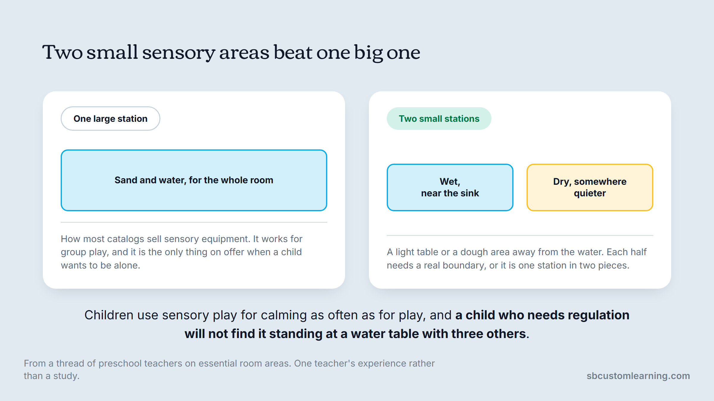
A child who needs regulation will not find it standing at a water table with three others. Splitting a function only works if each half has a real boundary, and a movable proprietary wall gives you one without committing to the layout for good.
Interactive Learning Displays That Are Not Screens
The phrase "interactive learning displays" almost always returns flat panels, which is unfortunate, because the wall-mounted version for under-fives is cheaper, more durable and more used.
A display is interactive when a child can change it. A laminated alphabet border is decoration. A magnetic board where letters move is a display. So is a felt story wall, a busy board with real latches and hinges, a wall-mounted mirror at toddler height, a pegboard where the pegs come out, or a sensory panel with textures screwed to a stud.
The design questions are mounting height and durability. Mount to the child's standing reach, not to a comfortable adult height, and expect every moving part to be pulled hard. Any hinge, gap or moving part is a pinch risk at toddler head height, so check those points before anything goes up.
Wall displays also solve a floor-space problem. In a room where every square foot is spoken for, the walls are the only unclaimed surface you have, and vertical interactive learning activities cost you nothing on the floor plan.
Where Screens Actually Fit
We do not sell screens, panels or software, so take this as a view from the furniture side rather than a recommendation to buy or avoid them.
The honest position is that interactive displays have a real evidence base in older grades and a much thinner one below kindergarten. The American Academy of Pediatrics has advised against solo screen use for children under 18 months and moved in 2026 toward judging quality and context rather than counting minutes. For a room of two- and three-year-olds, a panel usually ends up used by the adult, which makes it a presentation tool rather than an interactive one.
Where we do see them earn their place is in preschool rooms for documentation and for children who need a specific accessibility feature. A screen showing photographs of what the class built yesterday, at child height, prompts a lot of talk.
None of the questions worth asking is about the technology.
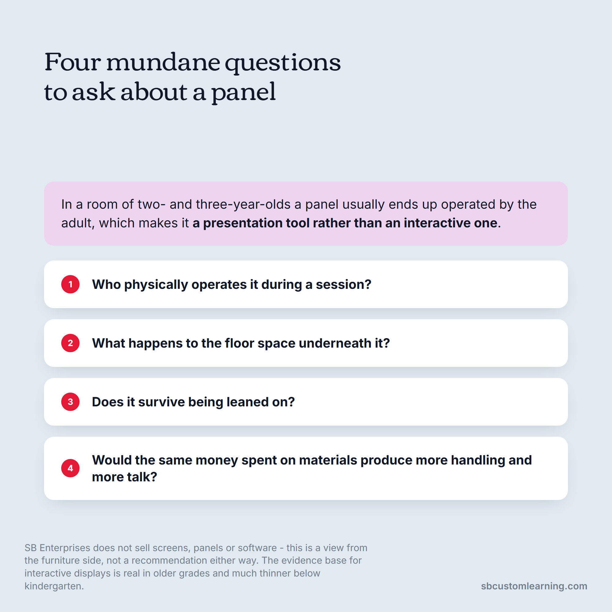
If you are weighing one, the questions worth asking are mundane. Who physically operates it during a session, what happens to the floor space underneath it, whether it survives being leaned on, and whether the same money spent on materials would produce more handling and more talk. In most preschool rooms we furnish, it would.
Movement Belongs in the Plan, Not in the Gaps
Gross motor play is the whole-body version of the same thing, and it gets treated as a break from learning rather than part of it.
That framing costs you room design. If climbing, balancing and crawling are a break, they get pushed to the playground and to whatever floor is left over indoors. If they are a center, they get planned space, equipment sized to the age group, and a surface that makes falling survivable. Treating gross motor play as curriculum rather than a break from it changes both what you buy and where it goes.
Indoors, the constraint is usually ceiling height and sightlines rather than floor area. A climbing structure that blocks a teacher's view of the book corner will be ruled out by your licensing visit before it is ruled out by anything else.
Winter in Illinois makes this less optional than it sounds. A center that treats gross motor as an outdoor activity has effectively removed it from the program for several months of the year.
Rotation Is What Keeps a Space Interactive
Interactive learning environments decay into wallpaper. Children stop seeing materials that have been in the same bin since August, and the center that was busy in September is empty by November.
Rotation is the fix, and it is a scheduling job rather than a purchasing one. The trap is treating rotation as a full swap of everything, which nobody has time for.
A rotation that survives a real term usually looks like this.
- Keep the anchors permanently: blocks, books, dough, the dramatic play kitchen.
- Swap one or two accent materials per center every two to three weeks.
- Keep the resting materials grouped by the center they belong to, so a swap takes minutes.
- Leave a picture of the finished center where the next adult will look for it.
That last step is what carries the system through staff changes. An image of the intended arrangement beats a written procedure, because nobody reads a procedure mid-shift.
Anchor materials rarely change from year to year, so our list of essential classroom supplies barely moves between seasons. Storage capacity is what makes rotation possible at all, so we plan cupboard and cabinet space during the design phase rather than adding it later.
Building a Center Into a Room That Fights You
Very few early learning rooms are rectangles with the sink in a sensible place, and interactive learning design gets decided by the awkward corners.
The teacher whose thread we cited above was working in an octagonal room. That is unusual, but odd shapes are not: alcoves, structural columns, radiators under the only good window, a door that swings into the exact spot the reading corner wants. Catalog furniture is designed for the rectangle, so it fits the awkward room badly, and the usual outcome is dead space nobody programs.
The distinction matters more than it sounds, because it decides whether a permit is involved.
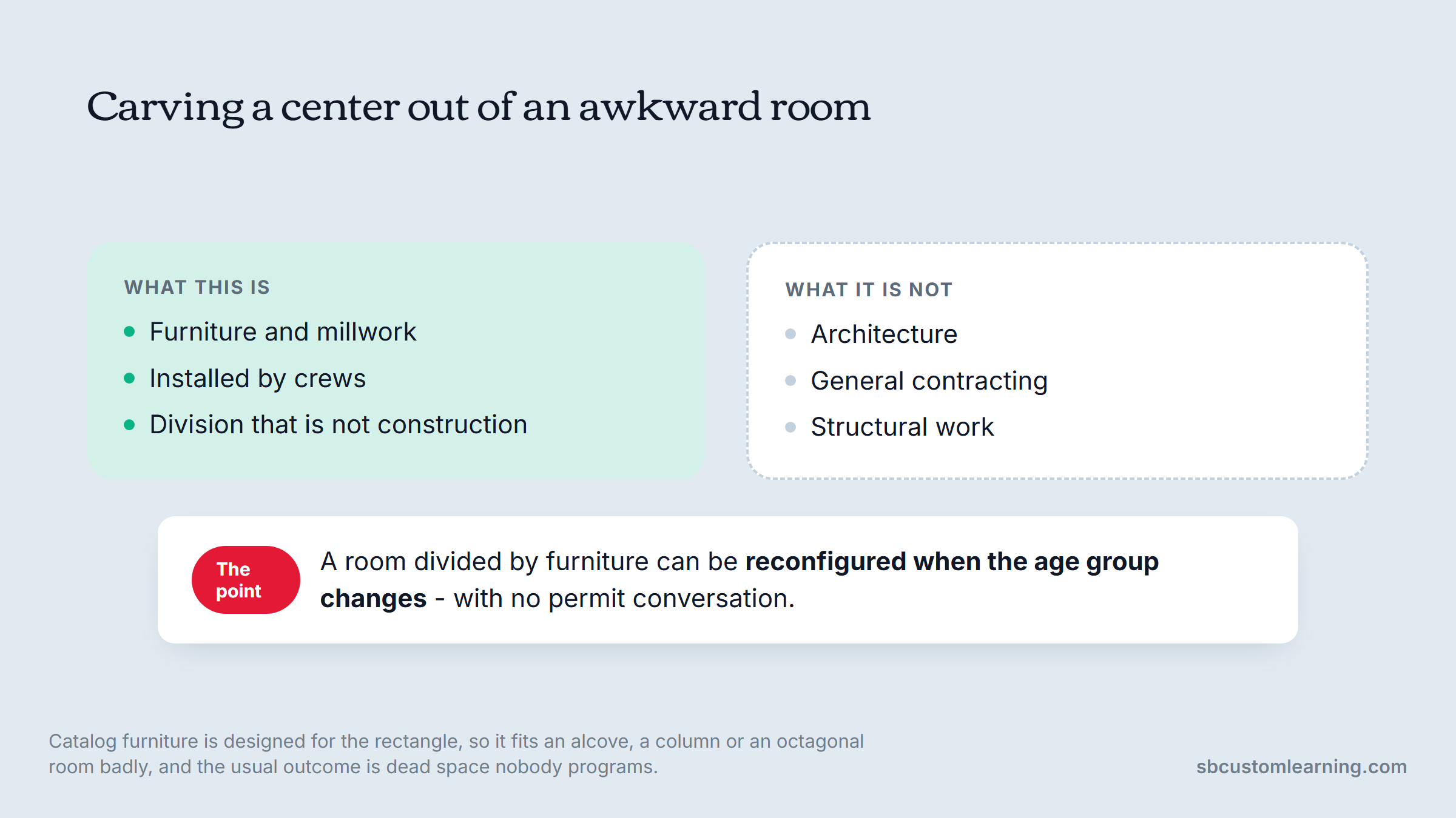
Two things fix it without a contractor. Division that is not construction lets you carve a defined center out of an open room, which is the argument for proprietary walls. A loft turns unused ceiling height into usable square footage.
Both matter for a reason worth stating plainly: this is furniture and millwork, installed by crews, not permanent construction. We are not architects or a general contractor, and we do not do structural work. That is the point rather than a limitation, because a room divided by furniture can be reconfigured when the age group changes without a permit conversation. Our custom play loft installation at Educare Chicago is the clearest example of the vertical version.
What to Buy First When the Budget Is Real
Most centers cannot build eight complete centers at once, so the order matters more than the list.
The sequence below is what we recommend when a room has to open with partial funding, and it is ordered by how much interaction each dollar produces rather than by what looks best in photographs.
| Priority | What to buy | Why it is first | What can wait |
|---|---|---|---|
| 1 | Low open shelving | Nothing else works without child-height storage | Decorative units |
| 2 | Sand and water table | The highest-use interactive surface per dollar | A second wet station |
| 3 | Blocks and magnetic tiles | Open-ended, near-indestructible, used daily | Themed block sets |
| 4 | Dramatic play kitchen | Drives the most language of any center | Full themed room build |
| 5 | Front-facing book display | Covers turn a book corner from ignored to used | Soft seating upgrades |
| 6 | Art easel and drying rack | Makes open-ended art possible near a sink | Kiln, light table |
| 7 | Wall-mounted busy panels | Recovers wall space, low cost | Digital displays |
The order assumes you already have tables and chairs at the right height for the age group, since those are a licensing matter rather than an enrichment one.
Funding shapes this as much as pedagogy does. Grant money often has to be spent inside a window and against a specific category list, so the sequence above frequently gets rearranged by what a funder will actually pay for. We format quotes and estimates for grant applications for that reason, and our services page covers how the sourcing and installation side works.
Getting the Room to Do the Teaching
The rooms that feel most interactive are rarely the ones with the most equipment in them. They are the ones where a child can reach what they want, where two children can work without colliding, and where an adult can kneel down and join in without moving furniture.
Three tests, and a room either passes them or it does not.
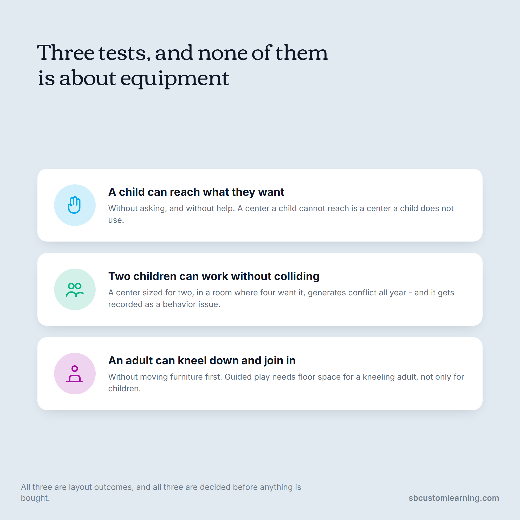
That is a layout outcome, and it is decided before anything is bought. Pick the centers your age group and square footage can genuinely support, size each one for the number of children who will want it, set every surface to the right height, and plan the storage that makes rotation possible in January.
If you would rather work through it with someone who furnishes these rooms every week, talk to our team and we will start from your floor plan and age groups.
Shopping with us is online rather than in a showroom. We send samples on request when a finish or a fabric genuinely needs to be seen in person.
FAQs
What is interactive learning in early childhood?
Interactive learning is any arrangement where a child acts on materials and gets an immediate response, then adjusts what they are doing. In practice that means sand and water play, blocks, dramatic play props, manipulatives and open-ended art, guided by an adult who is close enough to steer. It is different from the high school and college version of the term, which usually refers to technology.
What are the best tools for interactive learning in a preschool room?
The tools that produce the most handling per dollar are low open shelving, a sand and water table, unit blocks, magnetic tiles, a dramatic play kitchen and a front-facing book display. Wall-mounted busy panels and felt or magnetic boards add interaction without using floor space. Screens are optional and, below kindergarten, usually the lowest-value item on the list.
How do you set up interactive learning centers in a small classroom?
Split functions rather than shrinking everything. Use two or three small tabletop centers instead of one large area, move interactive displays onto the walls to recover floor space, and use shelving or freestanding partitions to define boundaries without building anything. Scattering books and counting materials through other centers also removes the need for separate literacy and math areas.
What interactive learning strategies work with two-year-olds?
Keep the number of choices small, put everything within standing reach, and give each material a clear place to return to. Toddlers do better with duplicates of popular items than with variety, since parallel play means two children often want the same thing. Sensory materials and simple cause-and-effect toys carry most of the interaction at that age.
How often should you rotate materials to keep a center interactive?
Every two to three weeks for accent materials, with anchor materials like blocks, books and dough staying out permanently. Rotate one center at a time rather than the whole room, keep the resting materials grouped the same way, and leave a picture of the intended arrangement nearby so anyone can restore it. Full swaps of everything are the version that gets abandoned by October.