Classroom Design Ideas for Early Learning Spaces
Key takeaways:
- The national classroom acoustics standard asks for background noise at or below 35 dBA. Real classrooms routinely run 50 to 60 dB, which is the gap most rooms never close.
- Teachers judging real rooms land on the same two failures: barren and clinical, or cozy but so crowded that nothing can happen in it.
- Sightlines set your maximum furniture height before taste does. Everything tall goes against a wall or gets cut.
- Design decisions are cheap on paper and expensive once installed, which is why the brief matters more than the mood board.
Most classroom design advice is about how a room looks, and most classroom design failures are about how a room sounds, drains, or blocks a teacher's view.
That mismatch is why so many centers end up with a room that photographs well and works badly. The pretty decisions are visible and reversible. The structural ones are invisible and, once the furniture is installed, effectively permanent.
This guide covers the second kind: the specifications and principles that decide whether a room functions, and how to turn them into a brief somebody can actually build from. It is written for daycare, preschool and early learning rooms, where the occupants are short, loud, and legally required to be visible at all times.
What Good Classroom Design Actually Means
Before the specifications, it is worth being clear about what a well-designed early childhood room is for, because the answer is not "looking calm on a tour."
Vanderbilt's IRIS Center, in its module on early childhood environments, frames the physical environment as something teachers actively design to maximize learning and engagement for every child, using clear boundaries made from shelves, furniture or other barriers so children understand what a space is for. It also treats infants and young toddlers as a separate design problem rather than a smaller version of the preschool one.
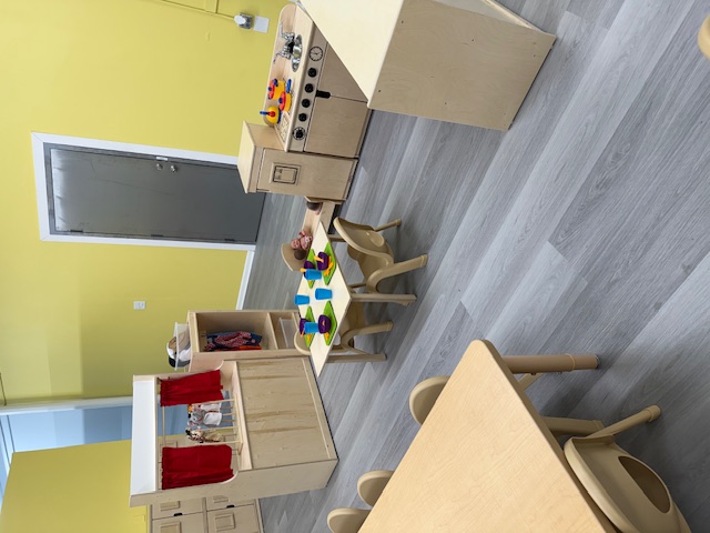
The useful idea in that framing is that furniture is communication. A child reads a room faster than they read a rule. If the block area has a clear edge, a floor surface that differs from the corridor, and shelving that faces inward, the boundary does the work that a teacher otherwise does verbally, twenty times a day.
Design, in this context, means arranging the physical environment so it carries as much of the instruction as possible.
Acoustics: The Specification Nobody Checks
Sound is the most consequential and least considered variable in a room full of young children.
The American National Standards Institute and the Acoustical Society of America publish a standard for this, ANSI/ASA S12.60. Its criteria are specific: for core learning spaces, one-hour average background noise should sit at or below 35 dBA, with reverberation time capped at 0.6 seconds for rooms under 10,000 cubic feet. It applies to spaces up to 20,000 cubic feet, which covers essentially every early learning classroom.
The standard and the average classroom are further apart than they sound.
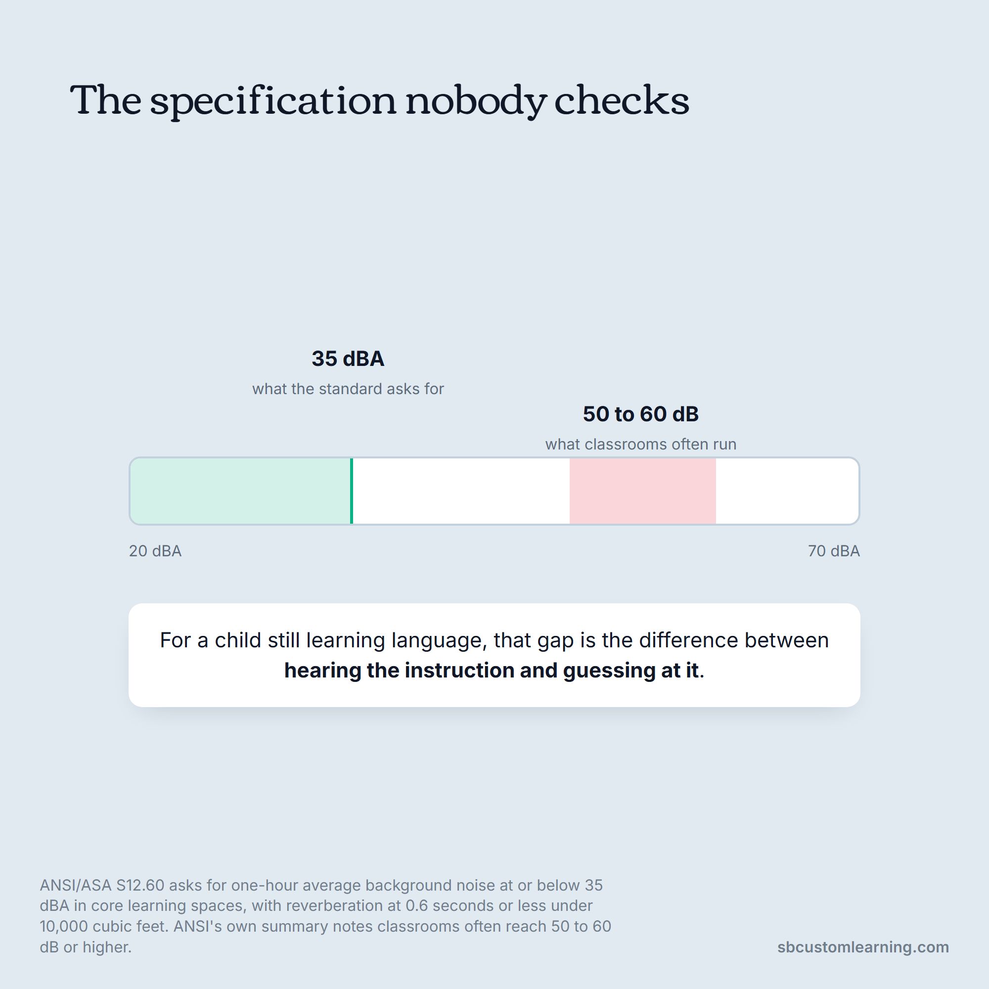
The problem is the gap between that and reality. ANSI's own summary notes that classroom noise levels often reach 50 to 60 dB or higher, well above the recommended 35. For children still learning language, and for any child with a hearing difference or learning English as a second language, that difference is the difference between hearing the instruction and guessing at it.
| Variable | What the standard asks for | What usually goes wrong | The affordable fix |
|---|---|---|---|
| Background noise | 35 dBA or below, one-hour average | HVAC hum, a corridor door, an outdoor play area outside the window | Door sweeps, service the HVAC, resite the loud centers |
| Reverberation | 0.6 seconds or less under 10,000 cubic feet | Hard floors, hard ceiling, glass, drywall on every side | Carpet or rugs in the quiet zone, fabric, acoustic panels |
| Room volume | Standard applies up to 20,000 cubic feet | High ceilings in converted spaces amplify everything | Suspended fabric or baffles rather than a lower ceiling |
| Sound between rooms | Limits on transmission between spaces | Shared walls with the gross motor room | Locate quiet zones away from the shared wall |
None of that requires an acoustician for a typical room. Carpet in the right zone, soft furnishings, and moving the noisy centers away from the quiet ones covers most of the distance, and it costs less than the furniture does.
Light, and What to Do With the Window You Have
Natural light is the single design feature people ask for and the one they plan for least.
The rules are simple enough. Put activities that need sustained visual attention, writing, puzzles, small manipulatives, near the daylight. Keep screens and light tables out of direct sun. And remember that a south or west window is a heat and glare source for part of the day, not just a light source, so a book corner in front of it is unusable in the afternoon.
Artificial light matters more than most people assume, because it is what you actually have for a good part of an Illinois winter. Bare fluorescent strips are unkind to a room, and the cheap fix is a diffusing panel or fabric rather than a rewire.
The other half of lighting is control. A room with one switch has one mood. Being able to drop the light in the quiet zone while keeping the art area bright is worth more than any single fixture, and it is usually achievable with lamps and task lighting rather than electrical work.
Color Without the Overstimulation Argument
Color in early years rooms attracts strong opinions and very little agreement, so it is worth separating what is settled from what is taste.
What is reasonably settled: a neutral background with deliberate accents gives you a room you can change, while saturated primary color on every surface gives you a room that fights whatever you put in it, including the children's own work. What is taste: whether that neutral is warm white, sage or wood tone.
The practical argument for restraint is not developmental, it is operational. Children's artwork, materials and displays supply plenty of color, and they change constantly. If the walls and furniture are already loud, the things that should stand out cannot.
Where color earns its place is as a wayfinding tool. A different accent per zone, carried on the rug and the shelf backs, tells a three-year-old where they are faster than a sign does. The low-stimulation version of this is what a Montessori-inspired classroom does on a limited budget, and it is largely a discipline about what you leave out.
The Barren Versus Cramped Problem
The most honest classroom design critique we have seen came from teachers assessing two real rooms rather than from a design guide.
In a Reddit thread asking which of two rooms for ages 3 to 5 was more appealing, the responses converged on a pair of opposite failures. The first room was called sterile and barren, with the most common criticism being that no child-made artwork was displayed anywhere. The second was warmer and better displayed, but held "too much furniture in too little of space," so it read as cramped.
One reply put the fix bluntly and cheaply: displaying work made by the children would have the most impact, and if the program already buys art supplies, it is the most affordable way to make a room inviting.
That is practitioner opinion rather than a study, so weigh it accordingly. The pattern is consistent enough with what we see in finished rooms to design against, and our work gallery is the version of that argument you can look at.
The two rooms failed in opposite directions, which is what makes the middle useful.
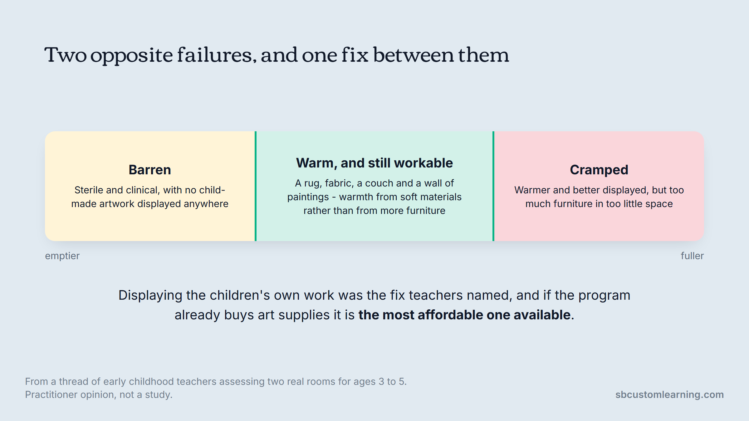
The resolution is that warmth should come from soft materials and children's work rather than from adding furniture. A rug, a fabric canopy, a couch and a wall of paintings warm a room without consuming the floor area that the room needs to function.
Sightlines Decide How Tall Anything Can Be
Every classroom design decision involving height is downstream of one requirement: an adult has to be able to see every child.
That is a licensing matter as well as a good idea, and it sets a hard ceiling on furniture. Our own working rule is that anything much above waist height on an adult starts breaking the view across a room, so tall units go against walls and dividers between centers are low shelving rather than screens. Check it against your own staff and your own room rather than trusting a number.
Work out the supervision position first. Stand where a teacher realistically stands during free choice, usually somewhere central with a view of the door, and check the sightline to every corner from there. Do it on the plan, then again once the furniture arrives, because the two rarely agree.
This is also why open-plan rooms are harder than they look. A large room with no visual breaks is easy to supervise and terrible for concentration, while a heavily divided one is calm and hard to supervise. Getting both means dividing at child height, not adult height, and it is the reason proprietary walls are built to divide a room without closing it.
Surfaces That Are Still Working in Ten Years
Classroom interior design gets judged on day one and paid for over a decade, and surfaces are where that gap shows.
Classroom interior design lives or dies on the floor, so start there. You want a hard, sealed, water-tolerant surface under the wet and messy zone, and something soft underfoot in the quiet zone, which usually means a hard floor throughout with rugs rather than fitted carpet in a room where paint happens. Carpet in an art area is a two-year mistake.
Three surface decisions, and each one is answered by the zone it sits in.
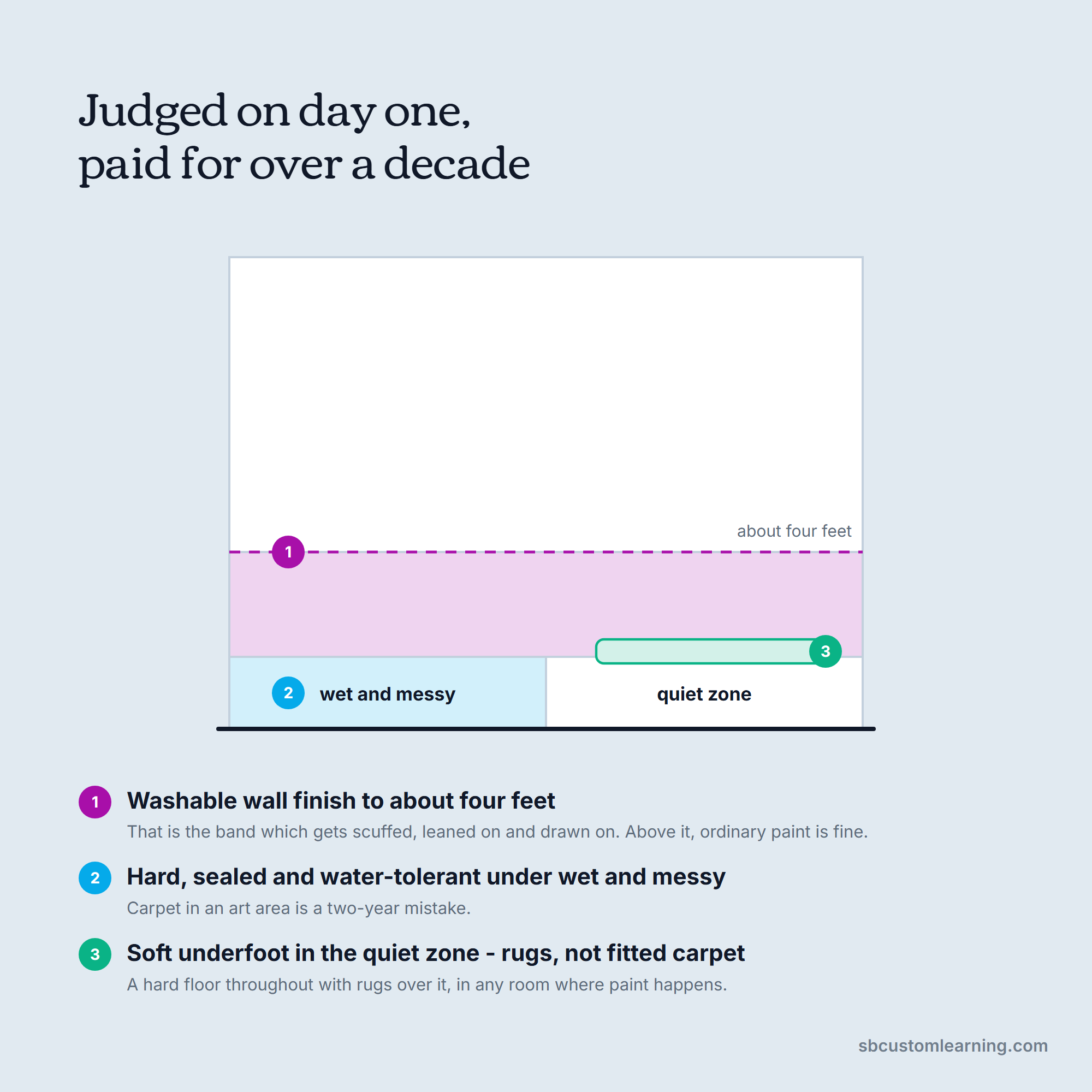
Wall surfaces matter mostly at child height, which is the band that gets scuffed, leaned on and drawn on. A washable finish to about four feet solves most of it. Above that, ordinary paint is fine.
Furniture finishes divide into laminate, which is cheap, wipeable and chips at the edges, and sealed hardwood, which costs more and survives longer. In a toddler room the honest answer is often laminate on the pieces that will be replaced anyway and hardwood on the ones that should outlast the age group.
Designing for the Age Band, Not the Room
The same square footage needs a different design for infants, toddlers and preschoolers, and the differences are bigger than furniture size.
Infant rooms are designed around adults on the floor and safe places to put a child down, so the priorities are clear floor area, low barriers, and sightlines to the diapering and sleeping areas. Toddler rooms are designed around movement and duplication, since parallel play means two children want the same thing and the design answer is two of them rather than a rule about sharing.
Preschool rooms are the ones that look like the photographs: defined centers, more materials, longer engagement. That is also why advice written for preschool fails badly when applied to a room of eighteen-month-olds.
| Age band | The room is organized around | Design priority | Common design error |
|---|---|---|---|
| Infants | Adults on the floor and safe places to set a child down | Clear floor area and sightlines to diapering and sleeping | Treating it as a small preschool room |
| Toddlers | Movement, and two children wanting the same object | Duplicates of popular materials, wide circulation | Too many different materials, too little space to move |
| Preschool | Defined centers and sustained engagement | Boundaries, depth of materials, a privacy space | Centers sized for fewer children than want them |
| Mixed age | Whatever the youngest child in the room can reach | Height and safety set by the youngest, not the average | Specifying to the oldest group present |
The mixed-age row is the one that catches centers out, since a single room serving a wide band has to be specified for its youngest occupant on every safety question.
Gross motor provision is the piece most often designed out of an indoor room and then missed all winter. Treating gross motor play as a design requirement rather than a playground activity changes both the floor plan and the ceiling height you need.
Buying to the Standard You Are Licensed Against
A classroom design that cannot pass a licensing visit is not a design, and the constraints usually arrive late in the process when they are most expensive.
Illinois centers answer to the Illinois Department of Children and Family Services (DCFS), whose day care licensing standards reach into furniture, layout, surfacing and supervision. DCFS licenses Illinois centers only, so if you operate in Wisconsin, Indiana, Michigan or elsewhere, read your own state's licensing agency rather than assuming these carry across.
What that means in practice is checking a piece against the standard before it is ordered rather than after it is installed. Height, stability, finish, fire rating and whether it blocks a sightline are all decidable at the quote stage.
All five are answerable before anything is ordered, and none of them after it is installed.
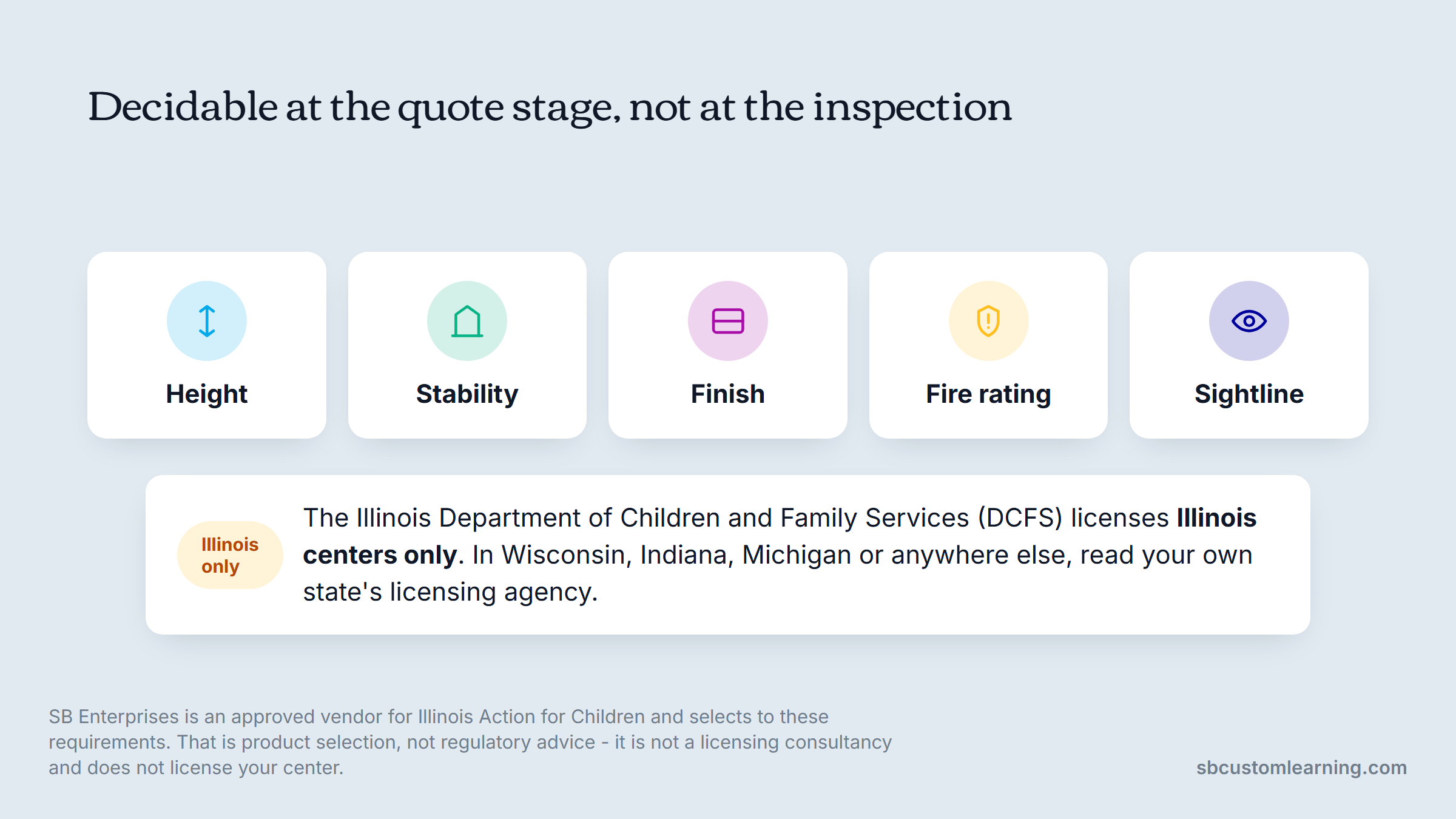
We select to those requirements as part of how we work, and we are proud to be an approved vendor for Illinois Action for Children, which matters most to centers using state funding streams. More than 20 years of buying for Illinois rooms is what our story is mostly made of.
We know the DCFS requirements and buy to them. We are not a licensing consultancy and we do not license your center, so treat our input as product selection rather than regulatory advice.
How to Write a Classroom Design Brief
Most projects go wrong because nobody wrote down what the room has to do before people started choosing things.
A brief does not need to be long. It needs to be specific about constraints and honest about money, and it needs to exist before anyone opens a catalog.
- State the age band, group size and staff ratio the room must support.
- Give the usable floor area, ceiling height and the position of sinks, doors and windows.
- Name the supervision position and the sightlines that must stay open.
- List the centers the program requires, in priority order, with the ones you would drop first.
- Set the acoustic and lighting problems you already know about.
- State the budget and whether it is one sum or phased across a funding cycle.
- Note anything that cannot change, from a radiator to a lease clause.
Item four is the one that saves projects. Naming which centers you would give up, before the money runs short, means the cut is a decision rather than an accident. The broader argument for treating design as the first step rather than the last is set out in our piece on thoughtful classroom design.
What Is Actually New in Modern Classroom Design
Modern classroom design in early years is less about new products than about a few genuine shifts in what gets specified.
The clearest is flexibility. Pieces that move, stack, nest or reconfigure are now the default rather than the premium option, because centers change age groups and enrollment more often than they change buildings. The classroom furniture trends we brought back from NeoCon 2026 lean heavily in that direction.
The second is that natural materials and muted palettes have moved from a niche Reggio-influenced preference into the mainstream of what manufacturers offer. That is good for rooms, since it makes the restrained option the easy one to buy.
The third is quieter and more useful: accessibility features that used to be specified separately are increasingly standard, so a room designed to be usable by a child with a mobility difference no longer looks different from any other room.
The Four Decisions That Come First
The rooms that hold up are the ones where the unglamorous decisions were made first. Sound was considered before color. The supervision sightline was drawn before the furniture was chosen. The floor under the art table was specified for paint rather than for photographs. The warmth came from children's work rather than from more furniture.
Each of the four prevents a specific failure, and none of them is a styling choice.
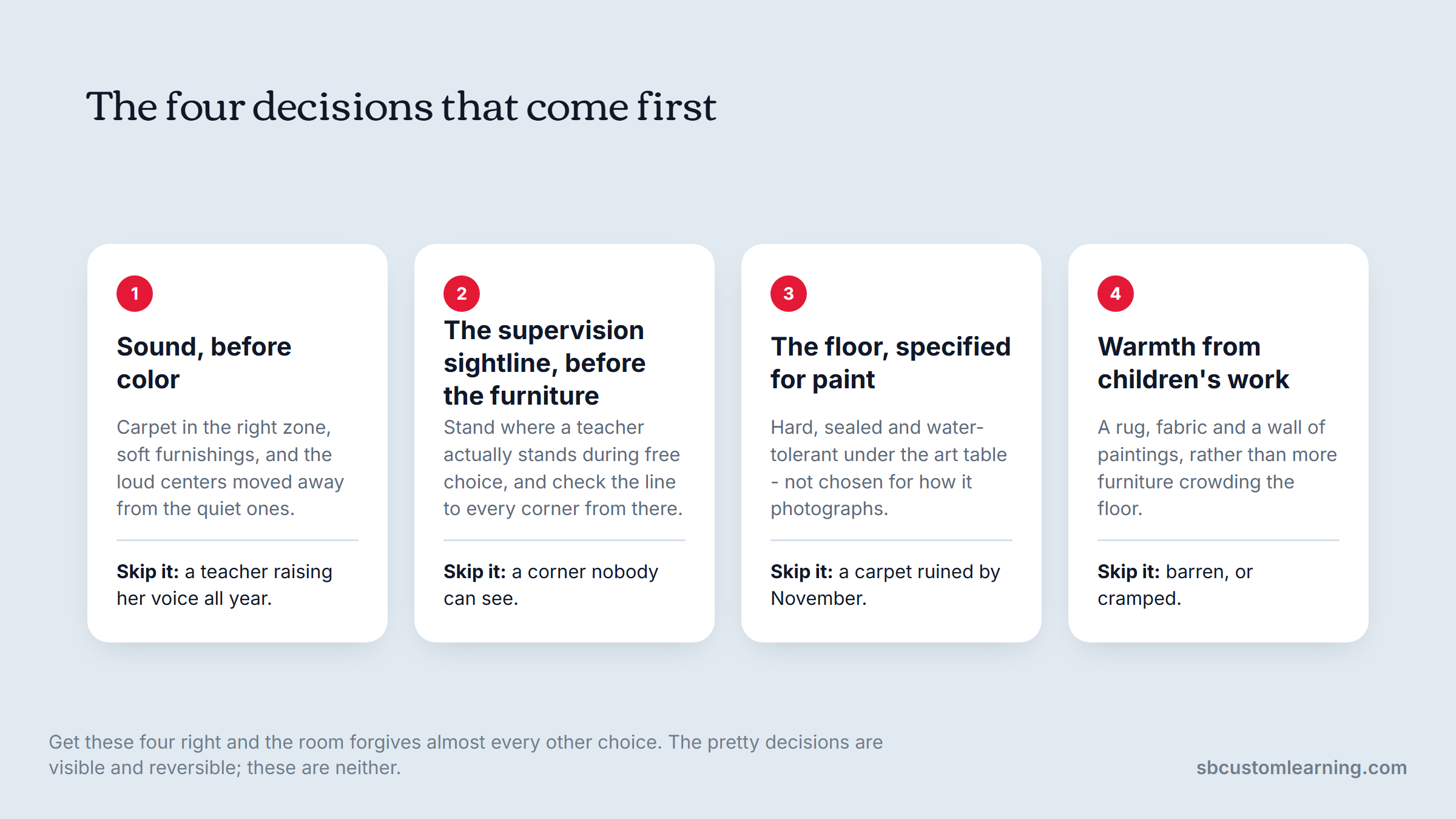
Do those four things and the room will be forgiving of almost every other choice you make. Skip them and no amount of styling will fix it, because the failures will be a teacher raising her voice, a corner nobody can see, and a carpet that is ruined by November.
If you would like a design plan built from your actual floor plan, age bands and constraints rather than a catalog page, talk to our design team.
FAQs
What makes a good classroom design for early learning?
Clear boundaries between centers, sightlines that let one adult see every child, acoustics that let children hear instruction, daylight where sustained attention happens, and surfaces chosen for the mess that will actually occur. Warmth should come from soft materials and displayed children's work rather than from adding more furniture, which is the most common way a cozy room becomes an unusable one.
How do I design my classroom layout?
Classroom layout design starts from the fixed points, the sinks, doors, windows and exits, so mark those and then mark where an adult will stand to supervise. Group centers by noise and water, keeping wet and loud away from quiet, and leave circulation routes genuinely empty. Choose furniture last, once the footprint and the sightline ceiling are both settled.
What are the best classroom design ideas for a small room?
Cut how many areas the room tries to hold rather than making each one smaller, because an area that cannot fit the children who choose it produces more disruption than leaving it out. Draw the boundaries at child height, put display and interactive surfaces on the walls, and let rugs rather than extra furniture mark where one area ends.
What does the classroom acoustics standard require?
ANSI/ASA S12.60 asks for one-hour average background noise at or below 35 dBA, and reverberation time no greater than 0.6 seconds in rooms under 10,000 cubic feet. Real classrooms often run 50 to 60 dB. Most of the gap can be closed with soft surfaces in the right zone, attention to HVAC noise, and keeping loud centers away from quiet ones.
What colors should an early learning classroom be?
A neutral background with a small number of deliberate accents gives you the most flexible room, because children's work and materials already supply strong color and change constantly. Using one accent color per zone, carried on the rug and shelf backs, also helps young children recognize where they are without needing signage.